On a Sunday in August, 1945, Jenkins accompanied the Allied military attachés to a service of General Thanksgiving at St. Paul’s Cathedral. Seated in the south transcept, he surveyed the surrounding “huge marble monuments in pseudo-classical style.” [MP 219/214 ] Recalling that some of the monuments had been described in The Ingoldsby Legends, a book that his mother read to him in childhood, he remembered: [MP 221/216 ]
… Sir Ralph Abercrombie going to tumble
With a thump that alone were enough to dispatch him
If the Scotchman in front shouldn’t happen to catch him.
The Ingoldsby Legends are stories and poems published between 1837 and 1847 by Richard Harris Barnham. Jenkins is quoting from the one of the poems, The Cynotaph, which begins:
Oh! where shall I bury my poor dog Tray,
Now his fleeting breath has pass’d away?
A ‘cynotaph’ or ‘dog’s tomb’ is not to be confused with a ‘cenotaph.’ In the poem Barnham proceeds to exclude St. Paul’s as a burial place after reviewing memorials such as those of Abercrombie and Sir John Moore.

Memorial for Lieutenant General Sir Ralph Abercrombie, K. B.
Sir Richard Westmacott, RA, 1801
Marble
St. Paul’s Cathedral, London
photo courtesy of Geogre P. Landow and the Victorian Web
Sir Ralph Abercrombie or Abercromby (1734-1801) was in the British Army from 1756 until his death. He served in the Seven Years War, in the French Revolutionary Wars, including important commands in the Caribbean, and in Ireland during the Irish rebellion. He was a Lieutenant-General when he died while leading troops in battles to regain Egypt from France. After his death, the House of Commons voted that a monument be built in his honor in St. Paul’s. Sir Richard Westmacott (1775-1856) did this momument early in his productive career, during which he produced the Achilles statue honoring the Duke of Wellington and many others still visible in the squares of London and elsewhere in the Commonwealth.
Coincidentally, the French writer Stendhal also knew these monuments. Powell admired the diaries of Stendhal more than he enjoyed the pioneering realistic novels The Red and The Black (1830) and The Charterhouse of Parma (1839) [TKBR p.181]. When Stendhal visited St. Paul’s in August, 1817, he ridiculed the heavy style of the Abercrombie monument; Jenkins seems to accept this criticism but reflects:
Nevertheless, one felt glad it remained there. It put on record what was then officially felt about death in battle, begging all that large question of why the depiction of action in the graphic arts had fallen in our own day almost entirely into the hands of the Surrealists. [MP 221/216 ]

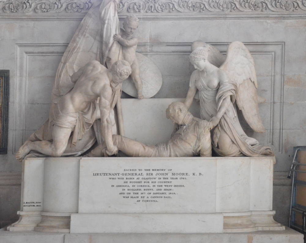
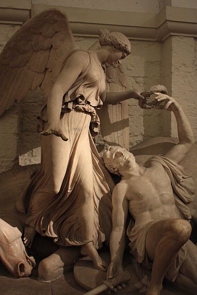
Monument to Lieutenant-General Sir John Moore, K.B.
John Bacon, Jr,
St. Paul’s Cathedral, London
photo courtesy of George P. Landow and the Victorian Web
Stendahl preferred the tomb of Sir John Moore (1761-1809), another Lieutenant-General honored with a memorial in St. Paul’s. His service included the American War of Independence, the French Revolutionary Wars, the Irish Rebellion, the Anglo-Russian invasion of Holland, and the war against France in Egypt and Syria, ending with his death at the battle of Corunna during the Penisular War in Iberia. John Bacon, Jr. (1877-1859) sculpted Moore’s monument, five other monuments in St. Pauls, and many others in Westminster Abbey and other British sites. Jenkins gives Barnham’s desciption of the scene:
Where the Man and the Angel have got Sir John Moore,
And are quietly letting him down through the floor,

Monument to Major General Ponsonby
designed by R. Theed, RA; executed by E. H. Bailey, RA, 1815
marble
St. Paul’s Cathedral, London
photo by Stephencdickson via Wikimedia Commons
Jenkins looked around for what Barnham called “that Queer-looking horse that is rolling on Ponsonby,” but did not see it because Ponsonby’s monument is at the north end of the cathedral. [MP 222/217].
The service seemed cold and depressing to Jenkins; however, the monuments recalled warmer days of his childhood before World War I. The music of time seems to echo off the monuments, which patriotically commemorate the protracted hostilities with the French in the late eighteenth and early nineteenth centuries. Barnham’s poem,The Cynotaph, reveals a Victorian sense of humor regarding the bombastic character of the sculptures in St. Paul’s. But the arch-Modernist Jenkins, exhausted by the unremitting sorrows of the war, is touched by a faint nostalgia for a pre-Modern moment when artists could celebrate patriotic valor without a hint of self-consciousness or embarrassment.

.jpg)